No, your eyes aren’t deceiving you, things do look different around here! After months of working with Curious & Co Design, and DM Design Solutions, I’m thrilled to finally rip the bandages off this new website and begin the next chapter of Lost in Cheeseland.
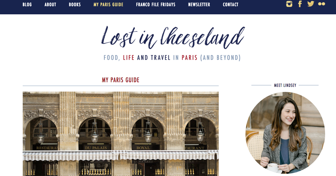
The itch for change bubbled to the surface as I began researching and writing my book. I realized it had been several years since I had made any significant changes to the site but felt frustrated and limited by the previous platform. On top of that, I knew that it wasn’t always easy to quickly locate information like restaurant tips, hotel recommendations and other practical details for a visit to Paris.
Here are some of the changes you’ll notice:
- Clear categories (indicated by icon on each post and in the sidebar) to differentiate each post
- Easy-to-find post and newsletter signup in the sidebar
- Straight-forward navigation at the top of the site
- My Paris Guide: my recommendations in a much more user-friendly format with drop-down menus for each category. (Note: this is very much a work in progress and I will be removing old links and updating with new in the coming weeks! Please bear with me)
- All my Franco File Friday features in one place!
- A handy contact form! I’ve already received inquiries and emails through this form which tells me it was much needed!
There are a few kinks I’m still working out and the comments from the old site are still in the process of being migrated to the new site but do take a look around! And of course, please let me know if you spot anything strange!
I think that you’ll enjoy the changes to Lost In Cheeseland as much as I do — it’s been seven years since I first launched it and it has evolved as my own Paris experience has evolved. Here’s hoping you’ll stick around to see how the next leg of this journey unfolds.
Merci, mes amis!


This new site looks lovely! I’ve only discovered your blog quite recently and am looking forward to getting fully immersed in your site and noting down many of your brilliant Paris recommendations 🙂
Love it. It’s really pretty and I really like the color scheme. I keep telling my husband I’d really like to visit Paris, so whenever that happens, at least I know where to go. Thanks 🙂
I absolutely love it, Lindsey. The colors are a perfect nod to Cheeseland, and the category icons are darling!
Looks great Lindsey and is super easy to navigate!
Love the new design! Aesthetically pleasing and functional to boot 🙂
Your site’s new facelift looks absolutely amazing ~ so refreshing!
Formidable ! I love it Lindsey, it looks just amazing and definitely reflects you!
looks great Lindsey…congrats on the new look!!
I love it. Super travail!
Love, love, LOVE the new design. Congratulations, Lindsey!!